

Applying the 7 Rules for More Effective Slide Presentations
I’ve been working on a slide presentation for a client and friend this week. It is a presentation for architects about how to properly design and detail a particular type of masonry wall system. This morning, I listened to a timely podcast by Michael Hyatt entitled “7 Rules for More Effective Slide Presentations”. I enjoyed his material on this subject and with his permission, I decided to run through these 7 rules and apply them to the presentation I am working on and share the results. Since I only had a few hours to apply these rules, I am far from satisfied with the results, but what I am sharing here is the process.
One thing to note at the top here is that Michael is a professional speaker who does very high profile engagements about intentional leadership, productivity and such. The presentation I am working on here is a technical presentation on architectural detailing. These are pretty disparate endeavors, but I feel that most, if not all, of the rules he put forth apply here.
MH Rule #1 – “Make sure you start with a solid presentation”
My grade : So-so
To paraphrase, this rule means that if your presentation is not very compelling, well planned and outlined, all the slides in the world are not going to help you no matter how visually appealing they may be. MH suggested not starting the presentation within your presentation software (keynote, powerpoint, etc.) because you can easily get off into a theme, color, design tangent and totally lose focus on the actual meat and potatoes of the actual presentation itself.
While I started this project on monday and hadn’t heard the seven rules until this morning, Wednesday morning – I did ok on this one. I was given an older presentation to start with and work from and rather than sitting inside PowerPoint and jostling things around, I did nothing. I did nothing but think about this project for about a week, periodically writing down ideas and notes in evernote. This eventually turned into an outline that I kept polishing in evernote until I was ready to dive into PowerPoint on monday morning. As a result, when I did start on Monday in powerpoint things flowed very smoothly. I set up a simple theme, trying not to be too cute, too cluttered or too cookie cutter about things.
Here is a look at the theme, just a bar across the top that has a top down plan view of a single wythe cmu wall and an elevation of a wall layered together in a muted grey. I just wanted a place to put a title at the top and a large area for content below.

The theme I came up with
MH Rule #2 – “Don’t give your presentation center stage”
My Grade – Yet to be determined
Too many times, as MH described, and as I have seen myself – presenters will cling to their powerpoint with a death grip and it becomes the presenter, they are just an operator. Since I will not be presenting this, I plan to print out the seven rules and pass it on to my client.
MH Rule #3 – “Use big compelling images”
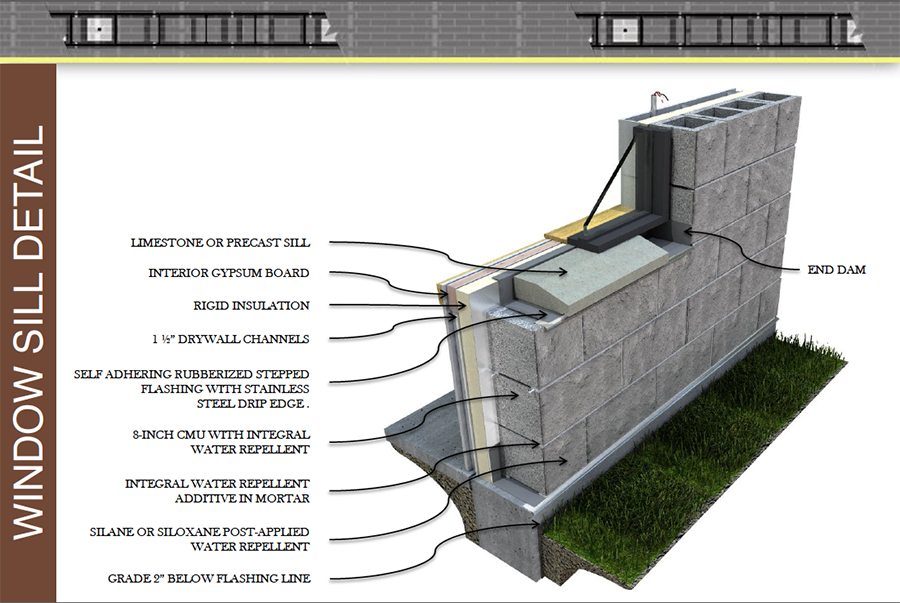
A photorealistic detail – in powerpoint each label comes in with a click so the presenter can discuss each element individually
MH Rule #4 – “Stick to one point per slide”
MH Rule #5 – “Make your slides readable”
My Grade – So-So
I went through and made everything as legible as possible. The only problem being that the call-outs on all the drawings can get a little bit tight and may be hard to read at a distance. I made them as big as possible and since the drawings are so visual, actually reading the text becomes less important, but still I’m not sure if I’m making the grade on rule #5
MH Rule #6 – “Eliminate Clutter”
MH Rule #7 – “Have a backup plan”
Here is a link to Michael Hyatt’s Article
How did I do? Drop a comment and let me know, feedback always appreciated.
-JY


